Homework 10
Maddie Winer
2025-04-09
Create FOUR visualizations using ggplot
Download libraries and packages for data.
library(ggplot2)
library(waffle)
library(ggthemes)
library(tidytuesdayR)
library("wesanderson")
library(pals)
library(scatterpie)
## scatterpie v0.2.4 Learn more at https://yulab-smu.top/library(beeswarm)
tuesdata <- tidytuesdayR::tt_load('2022-02-01')## ---- Compiling #TidyTuesday Information for 2022-02-01 ----## --- There are 3 files available ---
##
##
## ── Downloading files ────────────────────────────────────────────
##
## 1 of 3: "breed_traits.csv"
## 2 of 3: "trait_description.csv"
## 3 of 3: "breed_rank.csv"#tuesdata <- tidytuesdayR::tt_load(2022, week = 5)
breed_traits <- tuesdata$breed_traitsGraph 1
Waffle plot to look at range of subplots at site.
tabled_data <- as.data.frame(table(coat_type=breed_traits$`Coat Type`))

waffle <- ggplot(data=tabled_data) +
  aes(fill = coat_type, values = Freq) +
  waffle::geom_waffle(n_rows = 10, size = 0.33, colour = "black") +
  coord_equal() +
  theme_void()
  #scale_fill_manual(values=c("coral","grey95","goldenrod","red","green","blue","yellow","brown","orange","grey"))
waffle 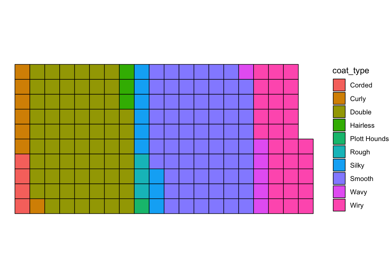
Graph 2
Ridgeline plot compare coat type with how well the breed
d <- data.frame(Breed=breed_traits$Breed ,With_Children=breed_traits$`Good With Young Children`, Other_Dogs = breed_traits$`Good With Other Dogs`, Coat_Type=breed_traits$`Coat Type`, Bark_Rating = breed_traits$`Barking Level`)
ridgeline <- ggplot(data=d) +
  aes(x=With_Children,y=Coat_Type,fill=Coat_Type) +
  ggridges::geom_density_ridges() +
  ggridges::theme_ridges()
ridgeline
## Picking joint bandwidth of 0.45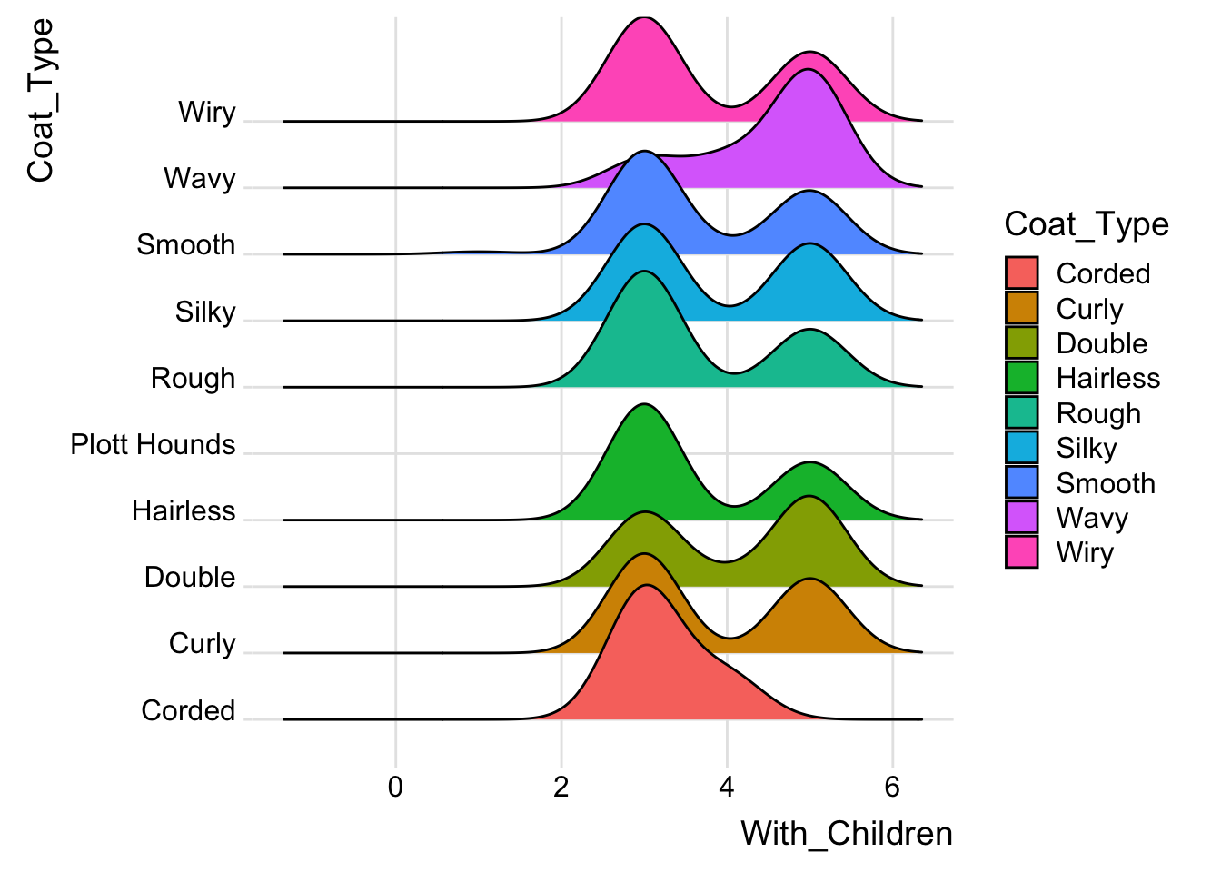
Graph 3
Beeswarm plot to compare coat type with friendliness with other dogs. Each dot represents one breed.
beeswarm <- ggplot(data=d) +
  aes(x=Coat_Type,y=Other_Dogs,color=Coat_Type) +
  ggbeeswarm::geom_beeswarm(method = "center",size=2)
beeswarm
## Warning: In `position_beeswarm`, method `center` discretizes the data
## axis (a.k.a the continuous or non-grouped axis).
## This may result in changes to the position of the points along
## that axis, proportional to the value of `cex`.
## This warning is displayed once per session.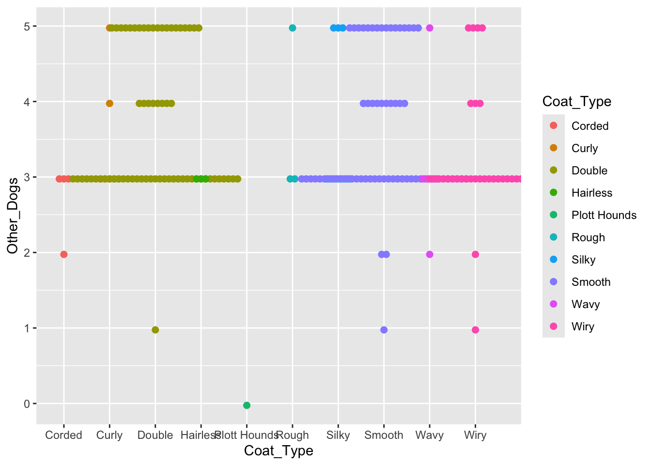
Graph 4
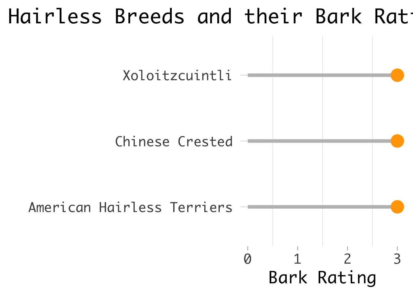
Lollipop plot to look at hairless breeds and their ratings for barking level.
d <- data.frame(Breed=breed_traits$Breed,Coat_Type=breed_traits$`Coat Type`, Bark_Rating = breed_traits$`Barking Level`)

edit_d<-d[d$Coat_Type=="Hairless",]

Lollipop <- ggplot(data=edit_d) +
  aes(x=Breed, y= Bark_Rating) +
  geom_segment(aes(x=Breed,
                   xend=Breed, y=0,
                   yend=Bark_Rating),
               color="grey",
               linewidth=2) +
  geom_point( color="orange", size=7) +
  labs(title="Hairless Breeds and their Bark Rating",
       x="",
       y="Bark Rating") +
  coord_flip() +
  theme_light(base_size=20,base_family=
                "Monaco") +
  theme(
    panel.grid.major.x = element_blank(),
    panel.border = element_blank(),
    axis.ticks.y = element_blank(),
    plot.title.position = "plot",
    plot.title = element_text(hjust = 0))
Lollipop